
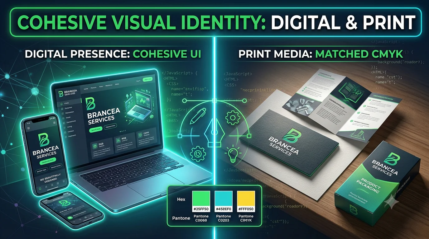
In the modern competitive marketplace, a business is judged within milliseconds of a potential customer laying eyes on its brand. Whether a user stumbles upon your mobile app while scrolling on a smartphone during their morning commute, clicks through a targeted digital ad, receives your corporate brochure in the mail, or walks past your physical storefront, your visual presence speaks volumes before a single word of copy is read.
Inconsistent branding—where your social media graphics look like they belong to one company, your website to another, and your printed collateral to a third—destroys consumer trust instantly. It signals disorganization, amateurism, and a lack of operational stability.
To build a memorable, enduring brand that commands authority and drives long-term customer loyalty, businesses must master the art of creating cohesive visual identity assets across both digital and print media.
At Brancea, we believe that true digital authority begins with a unified, meticulously crafted brand identity that resonates wherever your audience encounters you. In this comprehensive, SEO-friendly guide, we will break down what brand identity design services entail, explore the fundamental pillars of visual consistency, and reveal how harmonizing your digital and print assets can scale your business to new heights.
What is Brand Identity Design? Beyond the Logo
One of the most common misconceptions among business owners and startup founders is equating a “logo” with a “brand identity.” While a logo is an essential cornerstone, it is merely the anchor—the tip of the branding iceberg.
Your brand identity is the visible collection of all tangible design elements that together create a distinct, recognizable image of your company in the minds of your audience. It includes:
-
The Logomark and Logotype: Your primary logo variations, responsive logos, and favicon icons.
-
The Color Palette: Primary, secondary, and accent colors governed by strict hex, CMYK, and RGB values.
-
Typography Systems: Primary typefaces, secondary fonts, hierarchy rules, and tracking/kerning guidelines.
-
Imagery and Graphic Styles: Photography direction, illustration styles, iconography sets, texture overlays, and data visualization formats.
-
Brand Guidelines (Brand Book): The master rulebook that dictates how every single design element must be applied across digital and print touchpoints.
When these elements work together seamlessly, they create a cohesive visual language that communicates your brand values, establishes credibility, and builds unshakeable recognition.
The Digital vs. Print Divide: Why Cross-Media Consistency Matters
One of the greatest challenges in modern graphic design is bridging the gap between digital and print media. Designing for a glowing, high-resolution smartphone screen or a 4K desktop monitor requires an entirely different technical and psychological approach than designing for paper, fabric, signage, or packaging.
1. The Technical Reality: RGB vs. CMYK
-
Digital Media (RGB): Digital screens emit light using Red, Green, and Blue (RGB) color channels. Digital layouts allow for vibrant neon tones, subtle gradient transitions, high-contrast dynamic lighting, and rapid interactive scaling.
-
Print Media (CMYK): Physical printing presses use Cyan, Magenta, Yellow, and Key (Black) inks. Print requires careful color calibration, resolution checks (minimum 300 DPI), bleed lines, crop marks, and paper stock considerations.
A color that looks electric and vibrant on a high-end OLED laptop screen can easily print out dull and muddy if it hasn’t been properly converted and tested for CMYK specifications. Maintaining brand integrity across this technical divide requires professional expertise.
2. The Psychological Reality: User Engagement vs. Tactile Permanence
-
Digital Experience: Digital media is fast, fluid, and interactive. Users skim websites, scroll past social media feeds in milliseconds, and interact with micro-animations.
-
Print Experience: Print media is permanent, tactile, and deliberate. When a client holds a heavy, textured business card, flips through a saddle-stitched corporate brochure, or unpacks a branded product box, they engage physical senses (touch and weight) that deepen emotional connection and brand memory.
When your digital and print assets are perfectly synchronized, they reinforce one another, creating an omnichannel brand experience that feels professional, stable, and authoritative.
The Core Pillars of Cohesive Visual Identity Design
To achieve true harmony across digital and print media, your brand identity assets must be built upon four foundational pillars:
                         ┌─────────────────────────────┐
                         │     VISUAL IDENTITY PILLARS │
                         └──────────────┬──────────────┘
                                        │
        ┌───────────────────────────────┼───────────────────────────────┐
        ▼                               ▼                               ▼
┌───────────────┐               ┌───────────────┐               ┌───────────────┐
│  UNCOMPROMISED│               │  HIERARCHICAL │               │  FLEXIBLE     │
│   PALETTES    │               │  TYPOGRAPHY   │               │ ASSETS & UI   │
│ (RGB & CMYK)  │               │ (Readability) │               │ (Scalability) │
└───────────────┘               └───────────────┘               └───────────────┘
1. Uncompromised Color Systems
Your brand color palette is often the first visual cue recognized by consumers. To ensure consistency:
-
Define exact Hex and RGB codes for all digital applications (websites, mobile apps, social media templates, email newsletters).
-
Define corresponding CMYK and Pantone (PMS) spot color codes for all print collateral (letterheads, business cards, packaging, signage, billboards).
-
Establish strict dominance rules—specifying that 60% of a layout should feature your neutral background tone, 30% your primary brand color, and 10% your high-contrast accent color.
2. Scalable, Hierarchical Typography
Typefaces carry distinct emotional subtexts. A geometric sans-serif communicates modern tech-forward efficiency, while a traditional serif font communicates heritage, luxury, and authority.
-
Select primary and secondary typefaces that render with absolute crispness on digital screens (ensuring compliance with web font loaders and accessibility standards).
-
Ensure those exact same font families are licensed and available for desktop publishing and print production, maintaining consistent heading weights, tracking, and leading across all mediums.
3. Flexible Graphic Assets and Iconography
A cohesive brand identity features custom iconography, illustration styles, and graphic containers that can adapt to any canvas.
-
Whether an icon is displayed as a 16×16 pixel favicon in a browser tab or printed as a large-scale wall graphic in a corporate office, its stroke weight, geometry, and visual weight must remain identical.
4. Comprehensive Brand Guidelines (The Master Rulebook)
Without documentation, consistency collapses over time as different team members, freelance designers, or marketing agencies touch your brand assets. A professional brand identity design service delivers an exhaustive brand guidelines document that specifies:
-
Logo placement rules and minimum clear-space requirements.
-
Prohibited logo misuses (e.g., stretching, unauthorized color changes, placing over busy photo backgrounds).
-
Photographic tone and filtering guidelines.
-
Email signature templates, social media banners, presentation deck layouts, and stationery specifications.
Bridging the Gap: Integrating Digital and Print Touchpoints
To maximize your market impact, your digital and print assets must operate in a coordinated ecosystem. Here is how cohesive branding manifests across key mediums:
1. Digital Touchpoints
-
Website and Mobile Apps: Your digital headquarters. Clean graphic design and modern layouts ensure your color palette, typography, and iconography guide users smoothly through your conversion funnels.
-
Social Media Ecosystems: Custom-designed templates for LinkedIn, Instagram, YouTube, and X (formerly Twitter) ensure that every post, story, and banner instantly reinforces your brand identity.
-
Digital Advertising and Email Marketing: High-impact display banners, sponsored ad creatives, and structured email newsletters that mirror the visual cues of your physical marketing collateral.
2. Print Touchpoints
-
Stationery and Corporate Collateral: Premium business cards, letterheads, presentation folders, and compliment slips featuring tactile finishes (such as matte lamination, spot UV, or foil stamping) that elevate perceived value.
-
Marketing and Sales Literature: Annual reports, product catalogs, trifold brochures, and whitepapers that translate your digital typography and layout grids onto physical paper stock.
-
Environmental and Event Branding: Trade show booth displays, roll-up banners, signage, branded merchandise, and product packaging that envelop physical spaces in your brand’s visual universe.
The Commercial ROI of Cohesive Brand Identity Design
Many business leaders view brand design as an aesthetic luxury rather than a revenue-generating asset. This is a costly misconception. Cohesive visual identity design directly impacts your bottom line:
1. Building Instant Recognition and Recall
In a crowded marketplace, consumers are bombarded with thousands of brand messages daily. If your visual assets change unpredictably across channels, your audience cannot form a stable mental image of your business. Cohesive branding engraves your brand into the consumer’s memory, ensuring that whether they see your Instagram ad or pick up your flyer, they instantly recognize you.
2. Amplifying Perceived Value and Trust
Design is a direct proxy for quality. If a B2B enterprise or high-end consumer brand presents mismatched fonts, blurry pixelated logos on print materials, and clashing digital colors, prospects will instinctively question the reliability of their core product or service. Polished, unified visual design communicates professionalism, high market authority, and operational excellence.
3. Lowering Customer Acquisition Costs (CAC)
When your brand identity is strong and recognizable, your marketing efforts compound. Familiarity breeds trust, and trusted brands enjoy higher click-through rates, lower ad fatigue, higher conversion rates, and stronger word-of-mouth referral loops—all of which drive down your blended customer acquisition cost.
Why Pre-Made Templates and DIY Design Fall Short
In an era of drag-and-drop design tools and cheap template marketplaces, many businesses attempt to piece together their visual identity on a budget. This approach almost always backfires:
-
The “Frankenstein” Effect: Using a logo from one platform, stock fonts from another, and social media templates from a third creates visual chaos that alienates customers.
-
Lack of Vector Scalability: DIY logos created without professional vector software (like Adobe Illustrator) pixelate and break down when scaled up for print banners or vehicle wraps.
-
Absence of Strategic Positioning: A template designer does not understand your unique business model, target demographic, or competitive landscape. True brand identity design is rooted in strategic differentiation.
How Brancea Builds Authoritative Brand Identities
At Brancea, we reject cookie-cutter templates and superficial design. We recognize that building enduring digital and physical authority requires a meticulous, strategic approach to brand identity design.
When you partner with Brancea for your brand identity design services, our comprehensive methodology encompasses:
-
Discovery & Brand Strategy: We dive deep into your business model, core values, target audience, and competitive landscape to define your unique brand positioning before a single pixel is drawn.
-
Bespoke Visual Concepting: We craft custom logomarks, typography pairings, color systems (fully optimized for both RGB digital and CMYK print), and graphic asset libraries tailored specifically to your brand.
-
Omnichannel Asset Deployment: We design cohesive assets across your entire digital ecosystem (websites, social media, ads) and print collateral (stationery, packaging, marketing literature).
-
Comprehensive Brand Guidelines: We deliver an exhaustive, easy-to-use brand book that empowers your internal team and external partners to maintain absolute visual consistency across every future touchpoint.
-
Long-Term Digital Partnership: Brancea acts as your long-term creative and technical growth partner, helping you scale, evolve, and protect your brand identity as your enterprise expands.
Conclusion: Unify Your Visuals, Dominate Your Market
In the battle for consumer attention, consistency is your greatest weapon. If your digital presence and print collateral tell conflicting visual stories, you leak customer trust and dilute your marketing investments.
By investing in professional brand identity design services that create cohesive visual assets across digital and print media, you eliminate friction, elevate your perceived value, and build unshakeable brand authority.
Are you ready to harmonize your visual identity and leave fragmented design behind? Connect with Brancea today to discover how our custom graphic design and brand development expertise can accelerate your business growth.