
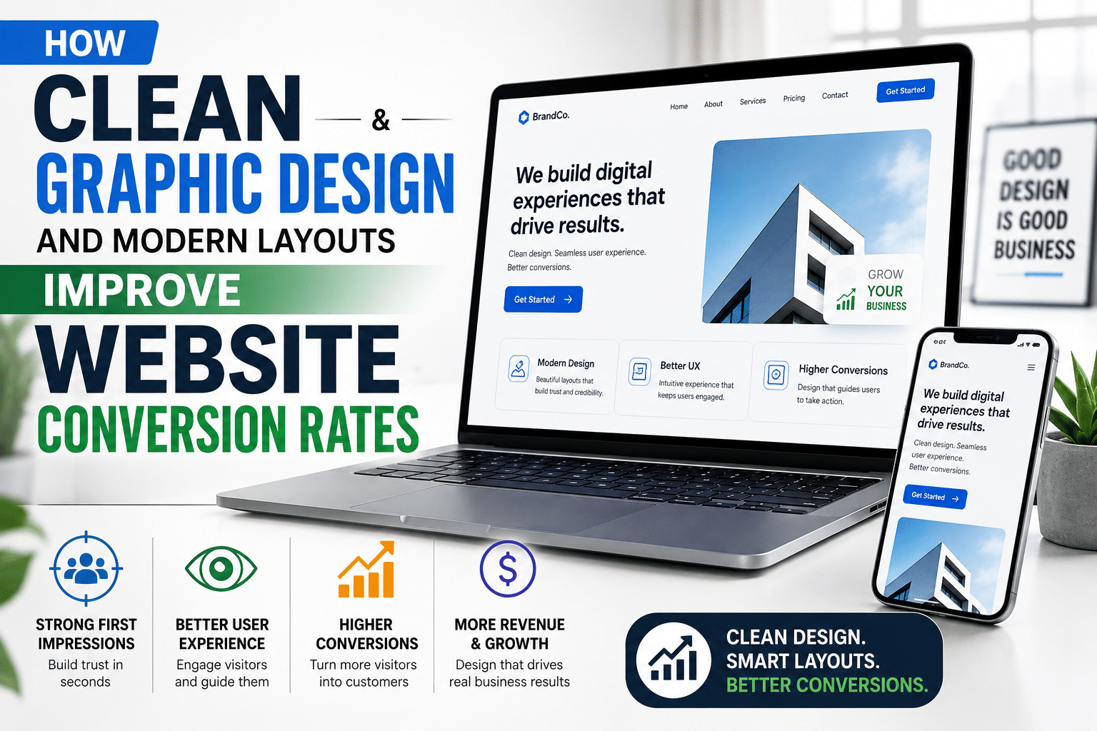
In the hyper-competitive digital ecosystem, your website is often the very first touchpoint a prospective customer has with your business. Long before a user reads your copy, reviews your pricing, or evaluates your feature set, they form a subconscious, split-second emotional judgment about your credibility. That snap judgment is dictated almost entirely by your visual design.
Many business owners and marketing leaders invest heavily in driving high-intent traffic through paid advertisements, social media campaigns, and aggressive search engine optimization (SEO). Yet, they inadvertently sabotage their return on investment (ROI) by sending that traffic to a cluttered, dated, or confusing website.
When your digital interface is cluttered with visual noise, inconsistent typography, and chaotic navigation, you introduce cognitive friction. Friction kills conversions. Conversely, investing in clean graphic design and modern layouts is one of the most powerful catalysts for transforming casual website visitors into loyal, paying customers.
At Brancea, we believe that true digital authority is built at the intersection of aesthetic sophistication and rigorous conversion rate optimization (CRO). In this comprehensive, SEO-friendly guide, we will explore the psychology of visual design, dissect the core elements of modern UI layouts, and reveal how clean design directly drives higher sales and bottom-line revenue.
The 50-Millisecond Rule: Why First Impressions Determine Conversions
Human beings are intensely visual creatures. Evolutionary psychology has wired our brains to process visual information 60,000 times faster than text. When a user lands on your website, their brain does not systematically read your value proposition word-for-word; instead, it absorbs the entire visual composition in an instant.
According to prominent web credibility research by Google and academic usability studies, users form an aesthetic judgment of a website in 50 milliseconds (0.05 seconds).
-
If your site looks outdated, cluttered, or amateurish, visitors will hit the back button instantly—regardless of how good your product or service actually is.
-
If your site features a clean, modern, professional layout, visitors immediately extend their trust, lowering their psychological guard and opening themselves up to your conversion funnel.
Design is not merely decoration. In digital commerce, design is communication, and clean graphic design is your silent salesperson.
The Anatomy of Modern UI Design: Core Principles That Drive Action
Modern user interface (UI) design is not about blindly following fleeting aesthetic fads. It is rooted in human-computer interaction (HCI) principles, cognitive psychology, and visual hierarchy. When a modern layout improves conversion rates, it does so by respecting how the human brain processes information and makes purchasing decisions.
                         ┌─────────────────────────────┐
                         │     MODERN UI PRINCIPLES    │
                         └──────────────┬──────────────┘
                                        │
        ┌───────────────────────────────┼───────────────────────────────┐
        ▼                               ▼                               ▼
┌───────────────┐               ┌───────────────┐               ┌───────────────┐
│     WHITE     │               │    VISUAL     │               │   INTUITIVE   │
│    SPACE      │               │   HIERARCHY   │               │   MOMENTUM    │
│ (Breathing    │               │ (Guiding the  │               │ (Frictionless │
│   Room)       │               │    Eye)       │               │    Flow)      │
└───────────────┘               └───────────────┘               └───────────────┘
1. Strategic White Space (Negative Space)
One of the defining characteristics of modern web design is the generous use of white space—or negative space. Cluttered websites attempt to fill every single pixel of the screen with banners, pop-ups, sidebars, and flashing text, mistakenly believing that more information equals more value.
In reality, cognitive overload paralyzes decision-making (a phenomenon known in psychology as Hick’s Law, which states that the time it takes to make a decision increases with the number and complexity of choices).
-
The Conversion Impact: Clean graphic design uses white space to isolate key elements—such as your primary Call to Action (CTA), product imagery, or core headline. By giving elements “breathing room,” you draw the user’s eye directly to what matters most, making the next step in the conversion funnel crystal clear.
2. Radical Visual Hierarchy
Visual hierarchy is the arrangement of elements in a way that implies importance. Through deliberate variations in scale, typography weight, contrast, and positioning, a modern layout dictates the exact order in which a user consumes information.
-
The Z-Pattern and F-Pattern: Eye-tracking studies show that users typically scan digital pages in an F-pattern or Z-pattern. Modern UI layouts leverage this natural scanning behavior by placing the most compelling hook at the top-left, supporting details across the scan path, and concluding with a high-contrast conversion button.
-
The Conversion Impact: When visual hierarchy is executed flawlessly, the user’s journey from awareness to consideration to conversion feels effortless. There is zero guessing about where to look or what to click next.
3. Purposeful Typography and Readability
Typography sets the emotional tone of your brand while dictating readability. Modern web design favors clean, highly legible sans-serif typefaces (or thoughtfully paired serif accents), optimal line heights, and comfortable character widths.
-
The Conversion Impact: If your body copy is difficult to read due to poor contrast, cramped line spacing, or overly decorative fonts, users experience visual fatigue and abandon the page. Clean typography keeps visitors engaged, allowing your persuasive copywriting to do its job.
4. Intentional Color Psychology and Contrast
Color is one of the most potent emotional triggers in design. Modern UI design avoids the garish rainbow palettes of the early web in favor of sophisticated, restrained color systems—typically featuring a dominant neutral background, a secondary brand tone, and a high-contrast accent color reserved exclusively for interactive elements and CTAs.
-
The Conversion Impact: Your primary Call to Action button (e.g., “Start Free Trial,” “Book a Demo,” or “Buy Now”) must stand out from every other element on the page. By using strategic color contrast, you ensure that the user’s eye is naturally magnetized toward the conversion trigger.
How Clean Graphic Design Directly Boosts Conversion Rates (CRO)
When business leaders ask how visual aesthetics translate into hard revenue, the answer lies in how clean design influences user behavior, trust, and cognitive processing. Here is how modern layouts directly amplify your conversion rates:
1. Eliminating Cognitive Friction in the Sales Funnel
Every element on a web page requires a fraction of the user’s mental energy to process. When a page is cluttered with misaligned columns, competing font sizes, inconsistent imagery, and jarring color contrasts, cognitive friction spikes.
-
High friction creates hesitation. Hesitation leads to doubt. Doubt leads to abandonment.
-
Clean graphic design removes friction by creating a harmonious, predictable, and logical environment. When the interface gets out of the way, users glide smoothly through your sales funnel.
2. Establishing Instant Brand Authority and Trust
In e-commerce and B2B lead generation, conversion requires trust. Users are handing over sensitive credit card information, personal data, or committing corporate budgets to your platform.
-
An amateurish, poorly designed website signals a lack of attention to detail, poor operational stability, and potential security risks.
-
A sleek, modern, professional web interface signals competence, market leadership, and high authority. Users instinctively feel safer transacting with a brand that looks polished and established.
3. Maximizing Mobile Conversion Rates
With mobile traffic accounting for the vast majority of web visits, modern UI design prioritizes responsive layouts that adapt fluidly across devices.
-
Cluttered desktop templates often collapse into broken, unreadable messes on mobile screens, destroying mobile conversion rates.
-
Modern layouts utilize modular, component-based design systems that ensure pristine readability, touch-friendly button sizes, and seamless thumb-driven navigation on smartphones and tablets.
4. Directing Focus with Micro-Interactions and Visual Cues
Modern graphic design incorporates subtle, purposeful visual cues—such as directional arrows, delicate underlines, subtle shadows, and responsive micro-interactions on hover or tap.
-
These design elements act as psychological signposts, subconsciously guiding the user’s cursor and attention toward form fields, checkout buttons, and key value propositions, thereby driving higher completion rates.
Why Common Templates Fail Modern UI Standards
Many businesses attempt to achieve modern design by purchasing cheap, pre-made website templates or themes. While templates offer a quick initial shortcut, they almost always fail to deliver elite conversion performance for several reasons:
-
Design Compromises: Templates are built to satisfy the mass market, meaning they are bloated with generic layouts, unnecessary animations, and rigid structures that rarely align with your unique product offering or buyer persona.
-
Visual Clutter: Template creators often pack pages with excessive decorative graphics, stock illustrations, and multi-column widgets that distract users from the core conversion goal.
-
Lack of Strategic Intent: A template designer does not understand your specific sales funnel, your target audience’s psychological triggers, or your brand positioning. True conversion-optimized design is built intentionally around your business objectives.
How Brancea Engineers High-Converting Digital Experiences
At Brancea, we view graphic design and UI architecture not as subjective artistic exercises, but as data-driven revenue drivers. We reject cookie-cutter templates and chaotic layouts, building custom digital ecosystems engineered to establish market authority and maximize conversion rates.
When you partner with Brancea, our design and development methodology is anchored in:
-
Strategic UX/UI Discovery: We analyze your target audience, competitor landscape, and conversion funnels to design user journeys that eliminate friction and guide visitors effortlessly toward action.
-
Modern, Minimalist Aesthetics: We craft clean, sophisticated visual hierarchies utilizing strategic white space, purposeful typography, and restrained color systems that elevate your brand credibility.
-
Conversion-Focused Layouts: Every element—from hero sections and value proposition blocks to micro-interactions and Call to Action placements—is engineered to capture attention and drive conversions.
-
Performance-First Execution: We pair stunning visual design with lightning-fast technical performance, ensuring your site crushes Core Web Vitals and retains impatient users.
-
Continuous Optimization: Brancea acts as your long-term digital growth partner, iteratively testing and refining your interface to compound your return on investment over time.
Conclusion: Design is Your Ultimate Commercial Multiplier
In the digital arena, you never get a second chance to make a first impression. If your website suffers from visual clutter, dated layouts, and high cognitive friction, your marketing budget is leaking revenue at every turn.
By investing in clean graphic design and modern UI layouts, you eliminate friction, establish instant brand authority, build unshakeable customer trust, and transform passive visitors into high-value conversions.
Are you ready to elevate your digital presence and turn your website into a high-converting masterpiece? Connect with Brancea today to discover how our custom web development and modern design expertise can accelerate your business growth.